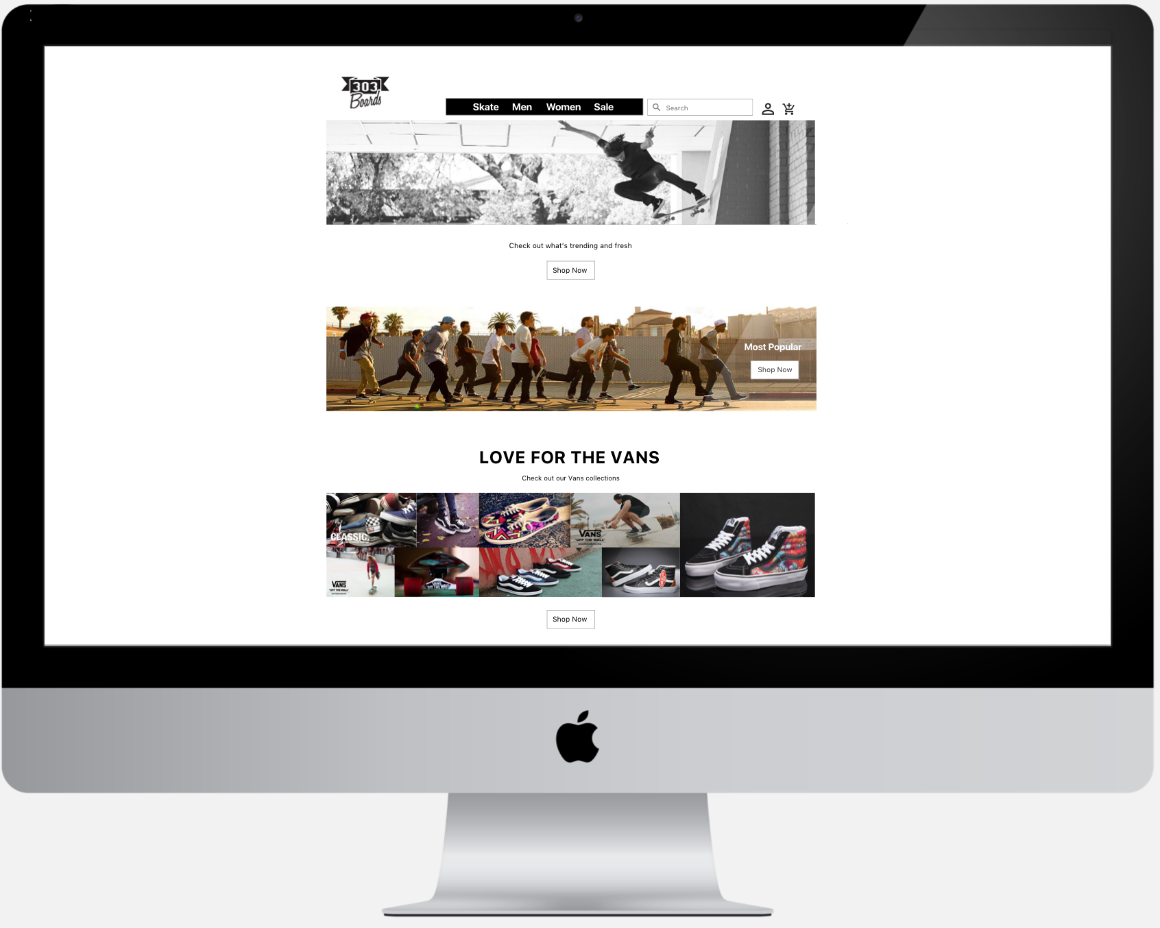
This project focuses on redesigning an E-Commerce Website for 303 Boards. My goal was to redesign and improve the user experience of the website within a two-week sprint while considering user needs and habits.
The Current Website
The current website design has some issue with their Information Architecture also doesn't encourage the potential buyer to shop. One of the pain points from the user, "it's really difficult to search for the product category".
Early stages of Wireframe
The New Design
The concept behind the new design it's to have a clear, clean and easy to navigate for the user.
On the top, we have clear main categories for the website. I break it down into only 4 categories. The categories are Skate, Men, Women, and Sale.
From there, on the body of the page, we have 4 more different categories. those 4 categories are, What's trending, Most popular, Product that 's popular right now (in this scenario it will be Vans however, it could change depending on the demand), and View all brands.
Fun Fact: On the Most Popular and shop now CTA is placed all the way on the right side on purpose. Most of the user testers wanting something creative on and funny for the button. So I created the CTA looks like it's being chased by the group of skateboarders because of its popularity. Since this fall under the Most Popular section and it worked.
After you select you sub-category, it will go to the product list, in this case, it will be on decks.
In this page, you could sort the product by newest and price.
In the product detail page, the customer also being given an opportunity to view other items that most customers viewed in the past or bought. By doing so, it could improve the chance to increase revenue.
Also on the next step, the CTA on keep shopping is more prominent to the checkout button with the same reason behind it.


